lr-notebook/
Responsive 2-column entry
2016-04-19Attachments:
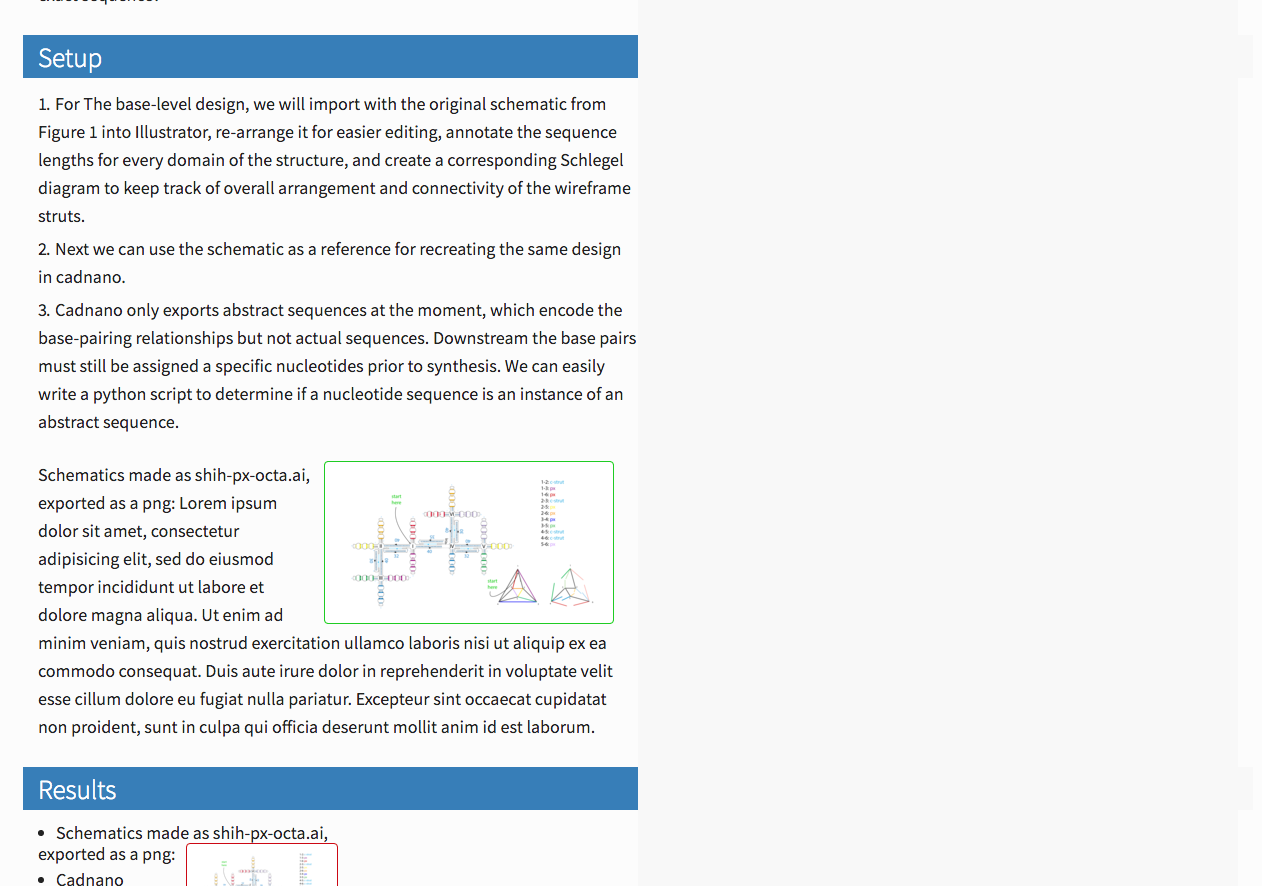
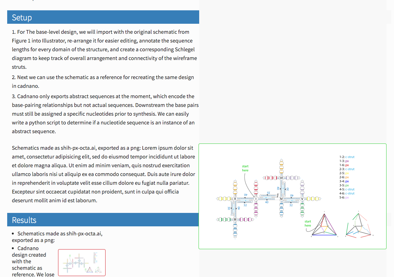


Overview
Today I am working on the CSS for the lr-notebook entry template. Entries are the actual pages where we compose the text, images, and data into lab notebook entries. This page, for example is an entry.
My goal is to create a 2-column layout that makes it very easy to display & align content (images, tables, markdown, etc.) in the right column.
Results
Notebook entries are now formatted in a simple 2-column layout.
How to use the right column
By default, almost everything is displayed in the left column. To move something to the right column, some html must be used. A div (?) tag defined with class="right" must go before the content, and then a closing div tag must go after the content. Make sure to include the closing div tag, otherwise the entire page may not display correctly.
<div class="right">
content goes here: images, urls, etc.
plain text, html, or markdown should work
</div>
Sections
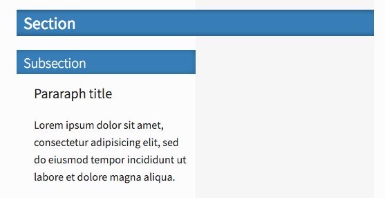
Headings are used to delineate sections, just as in normal markdown. # initiates a full section, and the stylized heading spans both left and right columns. ## is used for sub-sections, and the stylized heading spans only the left column. ### is useful for paragraph titles within a sub-section. Lesser headings (####, etc.) are similar to h3 but smaller font-size.
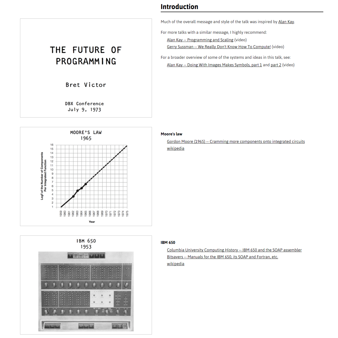
Here's a screenshot of how the above markdown content should render.

Notes
Images
Currently I support three ways to display an image

For images I use this snippet, mapped to ;img
<div class="right">
  <a href="%clipboard">
    <img class="thumb" src="%clipboard">
  </a><br>%clipboard
</div>
Fenced code blocks float right automatically
``` ← 3 backticksFenced code blocks (content between groups of 3 backticks) are positioned in the right column automatically, and do not need to be wrapped in a "right" class div. This is done to preserve markdown syntax highlighting.
TextExpander
Finally, I use this TextExpander snippet mapped to quickly move content to the right. Working in the editor, I will select and cut the text (⌘+x) to place it on the clipboard, and then type the snippet shortcut to restore the same text wrapped inside the div. I map to the shortcut ;rt.
<div class="right">%clipboard</div>
Methods
Starting work on this layout quickly exposed the limitations of my CSS knowledge. Below are some notes and resources that I used.
Inspiration


I really like the 2-column layouts of various essays on worrydream.com. They are very cleanly organized and as a reader I appreciate how referenced content is always immediately adjacent to the referring text.
In particular I referenced the talk notes from "Future of Programming" dbx talk.
The ClimateChange essay is very nicely designed, but its content and layout seemed a little too dense for my template. But I did like the formatting styles and in particular the section headers were a good starting point for h1 and h2 styles this page.
CSS selectors
Specificity
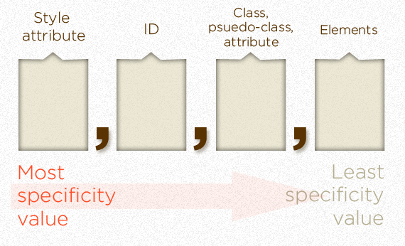
I found it useful to first learn about CSS selectors. I read an article called Specifics on CSS Specificity [1]. I liked the sections "Calculating CSS Specificity Value" and "Sample calculations". In particular it was helpful to understand that CSS selector types have actual numeric weight values associated with them.

Next I came across CSS Specificity Wars [2] - a nice visual representation of the relative strengths of CSS selectors:Storm Trooper (element) vs Vader (class) vs Emperor (id).


Finally Smashing Magazine has an article that's maybe worth a look [3]. It covers Attribute selectors, Child selector, Sibling combinators, and Pseudo-classes.
Adding a template-specific id: #entry
Because I wanted to format the content of entry pages, but not interfere with the rest of the site, I chose to create the #entry id that could be included in the entry template [4].
Additional notes
Parent selectors don't exist [5]
Two-column responsive layout
Existing options
The first thing I found was [6]. I didn't end up using this directly, but it's not that different in concept from what I ended up doing, in particular how CSS properties width, float, and clear are used to achieve 2 columns. Bierner's solution is specific to fenced code blocks that are output with a .highlight class, which is standard for code syntax highlighters [7].
I tried for a while to adapt it for different elements (e.g. code, or imgs), but realized what I actually wanted is to be able to wrap an arbitrary block of markdown or html in a custom div to put it in the right column. This raises another issue, which I ended up addressing with the javascript library "marked".
How the layout works
Basically everything that should be displayed in the left column is made slightly less than 50% width, floated left, and cleared to the left. Importantly, clearing to the left means that adjacent elements to not stack up next to each other and start to overlap with the right column. (I found the clear behavior non-intuitive when figuring this out).
  #entry p {
    width: 46%;
    float: left;
    clear: left;
  }
Next we define a ".right" class in the stylesheet, make it 50% width, and float and clear it to the left.
  .right {
    width: 50%;
    float: right;
    clear: right;
    display: inline;
  }
Fine tuning
I also stylize specific elements inside the right class, to make sure they are not too close to the edges, e.g.
  #entry .right p {
    width: 96%;
    line-height: 1.3;
    margin-left: 2rem;
  }
Rendering markdown inside "right" div
Markdown rendering does not apply to any content that is inside html tags. Thus, we cannot by default use markdown inside the "right" divs. I decided it's worth trying to restore this feature because it's nice to use markdown consistently in the document, e.g. for links.
I relied on marked [8], a markdown parser and compiler written in javascript. It works by including a javascript function that applies "marked" rendering to the innerHTML content of any div elements with class="right"
<script>
  function renderRightAsMarkdown() {
    var right = document.getElementsByClassName("right");
    for (var i=0; i<right.length; i++) {
      src = right[i].innerHTML
      right[i].innerHTML = marked(src);
    }
  }
  renderRightAsMarkdown();
</script>
It's not an ideal solution to have markdown in each column compiled separately (left column by Lektor when the page is built, and right column by marked in the browser). In particular, it means that url references are not aware of each other, which is annoying for citations.